Customer Segmentation with Machine Learning
FREE Online Courses: Knowledge Awaits – Click for Free Access!
Today we are going to create Customer Segmentation Project using Machine Learning. Let’s start!!
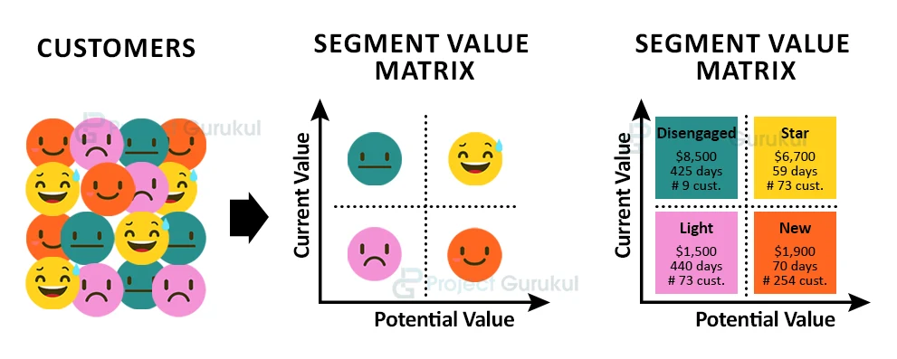
What is customer segmentation?
The practice of dividing a company’s customers into groups of individuals that are similar in specific ways relevant to marketing such as age, gender, interests, and spending habits is nothing but Customer Segmentation.
Customer segmentation is basically identifying key differentiators that divide customers into groups that can be targeted. The main goal of segmenting customers is to decide how to relate to customers in each segment to maximize the value of each customer to the business.
Nowadays Companies want to know their customers better so that they can provide useful customers with some goodies and also attract customers to purchase or make some kind of business with the company. When Companies know about customers and segment it into groups, it becomes easy for companies to send customers special offers meant to encourage them to buy more products.
Customer segmentation also improves customer service and assists in customer loyalty and retention.
With the help of Customer segmentation, we can also save waste of money on marketing campaigns. As we will be knowing the customers we need to target.
About Machine Learning Customer Segmentation Project
Earlier Customer segmentation was a challenging and time-consuming task. This is because for segmenting customers we need to perform hours of manual poring on different tables and querying the data in hopes of finding ways to group customers together. So to overcome this task we will use machine learning to segment customers.
So, in this article by ProjectGurukul, we will segment customers using machine learning algorithms, so that it will be useful for businessmen in personalized marketing and provide their customers’ relevant offers and deals.

Customer Segmentation Dataset & Project Code
We will be using dataset which is basically a csv file, you can download the dataset as well as project code by clicking the following link: Customer Segmentation Project & Dataset
The csv file consists of data from a supermarket mall. The dataset consists of columns like Customer ID, age, gender, annual income, and spending score ( it is something that is assigned to the customer on the basis of his behavior and purchasing data).
About K-means clustering
As we will be using k-means clustering algorithms to divide customers into similar groups. So it is better to understand what k-means clustering is. So K-means clustering is an Unsupervised Machine Learning Algorithm, meaning we don’t have any true value or labeled data to compare our output with.
The idea behind k-means clustering is very simple, it arranges the data into clusters that are very similar.
To implement K-means clustering we have to follow certain steps that are:
- In K-means clustering firstly we have to specify the number of clusters k.
- And then initialize centroids by first shuffling the dataset and then randomly selecting K data points for the centroids without replacement.
- Then it keeps iterating until there is no change to the centroids, i.e assignment of data points to clusters isn’t changing.
- Then it computes the sum of the squared distance between data points and all centroids.
- Assign each data point to the closest cluster (centroid).
- At last, Compute the centroids for the clusters by taking the average of all data points that belong to each cluster.

Required libraries for Machine Learning Customer Segmentation Project:
There are certain libraries you are required to install in your system, they are:
- Numpy (pip install numpy)
- Pandas (pip install pandas)
- Matplotlib (pip install matplotlib)
- Seaborn (pip install seaborn)
- Sklearn (pip install sklearn)
- mpl_toolkits (pip install mpl_toolkits)
You can install all this using a pip installer. So open the command prompt in your system and type pip install numpy, pip install pandas as written inside brackets.
Now without any further delay, let’s start implementing the Customer segmentation using Machine Learning:
1.) Import libraries:
We have to import the required libraries that we have installed above.
# importing libraries for ProjectGurukul ML Customer Segmentation Project:

import numpy as np
import pandas as pd
import matplotlib.pyplot as plt
import seaborn as sns
2.) Load the dataset:
As I am using google collabs that’s why I have to upload the dataset, if you are using jupyter notebook you don’t need to run this step. You just need to download the dataset and put it in the same folder where you have launched jupyter notebook.
# Load the dataset
from google.colab import files
uploaded = files.upload()
3.) Read the dataset:
Now we will load our dataset using pandas read_csv() method.
# read the dataset:
customer_dataset = pd.read_csv('Mall_Customers.csv')
4.) Analyse and Visualize our dataset:
Now we will perform exploratory data analysis on our dataset to understand it better.
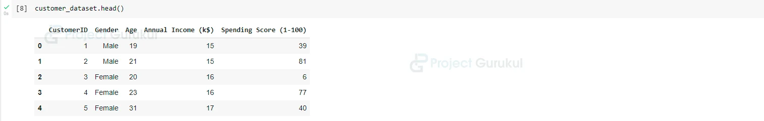
customer_dataset.head()
# shape of our dataset:
customer_dataset.shape

# statistical analysis of our dataset:
customer_dataset.describe()

# Checking type of columns present in our dataset:
customer_dataset.dtypes

# Checking number of rows and columns present in the dataset:
customer_dataset.info()

# check any null values present in the dataset:
customer_dataset.isnull().sum()

As we don’t need the CustomerID column, that is why in this step we will remove that column from the dataset.
# drop the CustomerID column:

customer_dataset.drop(['CustomerID'], axis = 1, inplace= True)

# checking the modified dataset:

customer_dataset.head()
5.) Visualize our dataset:
Now we will visualize the dataset using matplotlib and seaborn to understand the relationship between columns.
plt.figure(1, figsize=(12,4))
n = 0
for x in ['Age', 'Annual Income (k$)', 'Spending Score (1-100)']:
n+=1
plt.subplot(1,3,n)
plt.subplots_adjust(hspace= 0.5, wspace=0.5)
sns.distplot(customer_dataset[x], bins = 20)
plt.title('ProjectGurukul Distplot of {}'.format(x))
plt.show()

From this, we understand that 20-40 age group people do more shopping in comparison to other age group peoples.
And also, the person whose annual income is between $50,000 to $1,00,000 do more shopping in comparison to others.
Now let’s see which gender purchase more things:
plt.figure(figsize=(15,5))
sns.countplot(y = 'Gender' , data = customer_dataset)
plt.title('ProjectGurukul')
plt.show()

So it is obvious that females do more shopping in comparison to males.
Now let’s create a violin plot using the seaborn library, for the three columns that are ‘Age’, ‘Annual income’, ‘’Spending score’.
plt.figure(1, figsize=(15,7))
n = 0
for cols in ['Age', 'Annual Income (k$)', 'Spending Score (1-100)']:
n+=1
plt.subplot(1,3,n)
sns.set(style = 'whitegrid')
plt.subplots_adjust(hspace= 0.5, wspace=0.5)
sns.violinplot(x = cols,y = 'Gender', data = customer_dataset)
plt.ylabel('Gender' if n==1 else '')
plt.title('ProjectGurukul Violin Plot')
plt.show()

Now we will divide the age into groups for better visualization and understanding.
# Creating group of ages:
age_18_25 = customer_dataset.Age[(customer_dataset.Age >= 18) & (customer_dataset.Age <= 25)]
age_26_35 = customer_dataset.Age[(customer_dataset.Age >= 26) & (customer_dataset.Age <= 35)]
age_36_45 = customer_dataset.Age[(customer_dataset.Age >= 36) & (customer_dataset.Age <= 45)]
age_46_55 = customer_dataset.Age[(customer_dataset.Age >= 46) & (customer_dataset.Age <= 55)]
age_above_55 = customer_dataset.Age[(customer_dataset.Age >= 56)]

agex = ['18-25', '26-35', '36-45','46-55','55+']
agey = [len(age_18_25.values),len(age_26_35.values),len(age_36_45.values),len(age_46_55.values),len(age_above_55.values)]

plt.figure(figsize = (15,6))
sns.barplot(x = agex, y = agey , palette='mako')
plt.title('ProjectGurukul')
plt.xlabel('Age')
plt.ylabel('Number of Customer')
plt.show()

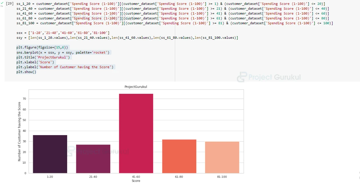
As we have done for the ‘Age’ column, similarly we divide ‘Spending Score’, and ‘Annual Income’ columns into groups (we will follow the same steps as we have done for the ‘Age’ column, just we change the values.)
# Creating groups of ‘Spending Score’ column and visualizing it:
ss_1_20 = customer_dataset['Spending Score (1-100)'][(customer_dataset['Spending Score (1-100)'] >= 1) & (customer_dataset['Spending Score (1-100)'] <= 20)]
ss_21_40 = customer_dataset['Spending Score (1-100)'][(customer_dataset['Spending Score (1-100)'] >= 21) & (customer_dataset['Spending Score (1-100)'] <= 40)]
ss_41_60 = customer_dataset['Spending Score (1-100)'][(customer_dataset['Spending Score (1-100)'] >= 41) & (customer_dataset['Spending Score (1-100)'] <= 60)]
ss_61_80 = customer_dataset['Spending Score (1-100)'][(customer_dataset['Spending Score (1-100)'] >= 61) & (customer_dataset['Spending Score (1-100)'] <= 80)]
ss_81_100 = customer_dataset['Spending Score (1-100)'][(customer_dataset['Spending Score (1-100)'] >= 81) & (customer_dataset['Spending Score (1-100)'] <= 100)]

ssx = ['1-20','21-40','41-60','61-80','81-100']
ssy = [len(ss_1_20.values),len(ss_21_40.values),len(ss_41_60.values),len(ss_61_80.values),len(ss_81_100.values)]

plt.figure(figsize=(15,6))
sns.barplot(x = ssx, y = ssy, palette='rocket')
plt.title('ProjectGurukul')
plt.xlabel('Score')
plt.ylabel('Number of Customer having the Score')
plt.show()
# Creating groups for ‘Annual Income’ column and visualizing it:

ann_0_30 = customer_dataset['Annual Income (k$)'][(customer_dataset['Annual Income (k$)'] >= 0 ) & (customer_dataset['Annual Income (k$)'] <= 30)]
ann_31_60 = customer_dataset['Annual Income (k$)'][(customer_dataset['Annual Income (k$)'] >= 31 ) & (customer_dataset['Annual Income (k$)'] <= 60)]
ann_61_90 = customer_dataset['Annual Income (k$)'][(customer_dataset['Annual Income (k$)'] >= 61 ) & (customer_dataset['Annual Income (k$)'] <= 90)]
ann_91_120 = customer_dataset['Annual Income (k$)'][(customer_dataset['Annual Income (k$)'] >= 91 ) & (customer_dataset['Annual Income (k$)'] <= 120)]
ann_121_150 = customer_dataset['Annual Income (k$)'][(customer_dataset['Annual Income (k$)'] >= 121 ) & (customer_dataset['Annual Income (k$)'] <= 150)]

annx = ['$ 0-30,000','$ 31,000-60,000','$ 61,000-90,000','$ 91,000-1,20,000','$ 1,21,000-1,50,000']
anny = [len(ann_0_30.values),len(ann_31_60.values),len(ann_61_90.values),len(ann_91_120.values),len(ann_121_150.values)]

plt.figure(figsize=(15,6))
sns.barplot(x = annx, y = anny, palette='Spectral')
plt.title('ProjectGurukul')
plt.xlabel('Income')
plt.ylabel('Number of Customer')
plt.show()
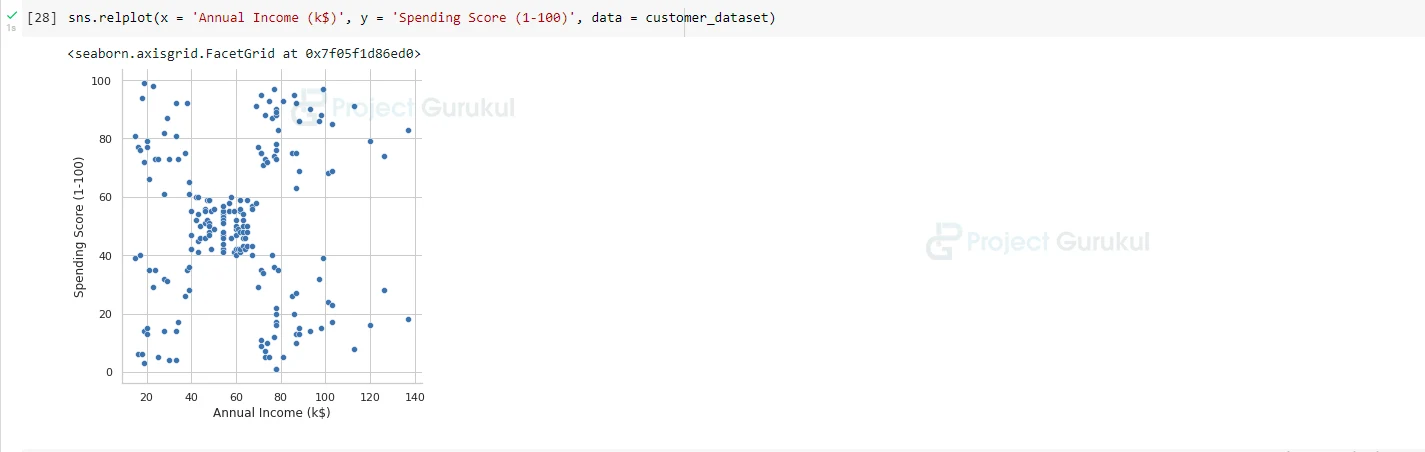
Let’s also create a relation plot between the ‘Annual Income’ column and ‘Spending Score’ column.
sns.relplot(x = 'Annual Income (k$)', y = 'Spending Score (1-100)', data = customer_dataset)
6.) Creating Clusters:
Now let’s start creating clusters for different columns of our dataset and perform k-means clustering and also visualize it.
- First, we will create a cluster for ‘Age’ and ‘Spending Score’ columns.
So first let’s find the number of clusters:
from sklearn.cluster import KMeans
wcss=[]
for k in range(1,11):
kmeans = KMeans(n_clusters = k, init = 'k-means++')
kmeans.fit(X1)
wcss.append(kmeans.inertia_)

plt.figure(figsize=(12,6))
plt.grid()
plt.plot(range(1,11), wcss, linewidth = 2, color = 'red', marker = '8')
plt.xlabel('K Value')
plt.ylabel('WCSS')
plt.show()

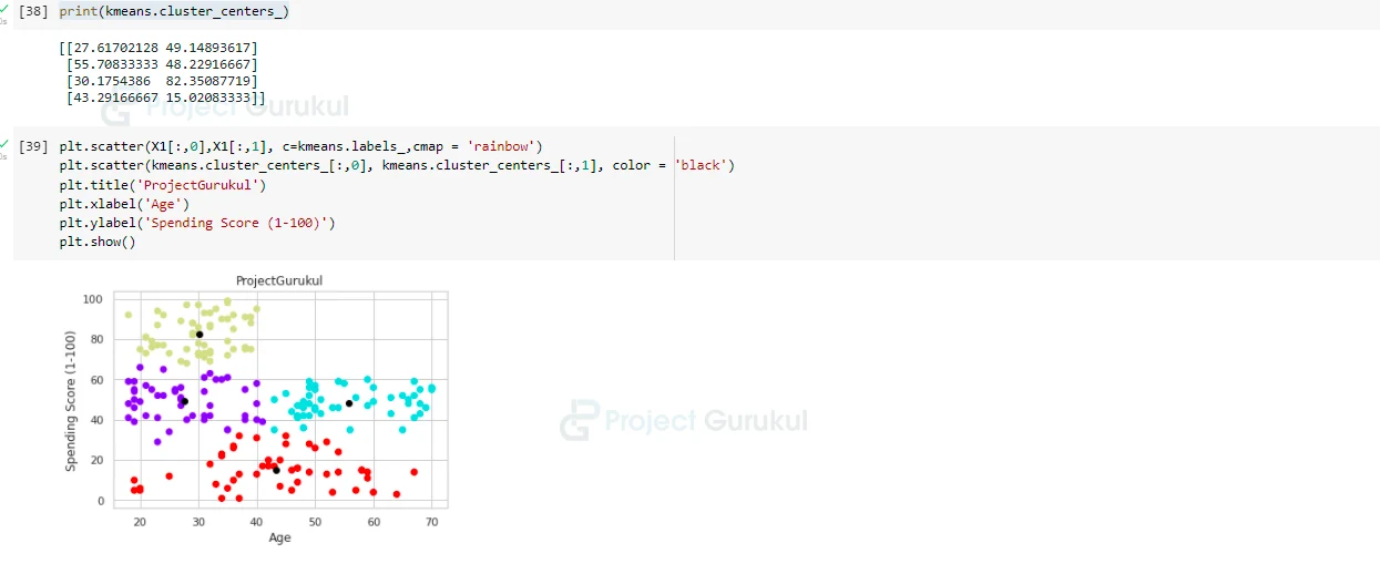
Fit that clusters into KMeans model and predict labels, and also find centroids:
kmeans = KMeans(n_clusters = 4)
label = kmeans.fit_predict(X1)

print(label)

print(kmeans.cluster_centers_)

# Visualize our clusters(basically different groups):

plt.scatter(X1[:,0],X1[:,1], c=kmeans.labels_,cmap = 'rainbow')
plt.scatter(kmeans.cluster_centers_[:,0], kmeans.cluster_centers_[:,1], color = 'black')
plt.title('ProjectGurukul')
plt.xlabel('Age')
plt.ylabel('Spending Score (1-100)')
plt.show()
Similarly, we perform same operations on different columns and visualize clusters of each:
Now we will find the cluster of ‘Annual Income’ and ‘Spending Score’ columns:
# Creating Clusters based on Annual Income and Spending Score:
X2 = customer_dataset.loc[:,['Annual Income (k$)','Spending Score (1-100)']].values

from sklearn.cluster import KMeans
wcss=[]
for k in range(1,11):
kmeans = KMeans(n_clusters = k, init = 'k-means++')
kmeans.fit(X2)
wcss.append(kmeans.inertia_)
snippsnipp
plt.figure(figsize=(12,6))
plt.grid()
plt.plot(range(1,11), wcss, linewidth = 2, color = 'red', marker = '8')
plt.xlabel('K Value')
plt.ylabel('WCSS')
plt.show()
Let’s fit this into our KMeans algorithm and predict labels and also find centroids:
kmeans = KMeans(n_clusters = 5)
label = kmeans.fit_predict(X2)

print(label)

print(kmeans.cluster_centers_)

# visualize clusters:

plt.scatter(X2[:,0],X2[:,1], c=kmeans.labels_,cmap = 'rainbow')
plt.scatter(kmeans.cluster_centers_[:,0], kmeans.cluster_centers_[:,1], color = 'black')
plt.title('ProjectGurukul')
plt.xlabel('Annual Income')
plt.ylabel('Spending Score (1-100)')
plt.show()
- Now we will create a cluster for all the three columns that is ‘Age’, ‘Annual Income’, and ‘Spending Score’.
# Creating a Clusters based on Age, Annual Income, and Spending Score:
X3 = customer_dataset.iloc[:,1:]

wcss=[]
for k in range(1,11):
kmeans = KMeans(n_clusters = k, init = 'k-means++')
kmeans.fit(X3)
wcss.append(kmeans.inertia_)

plt.figure(figsize=(12,6))
plt.grid()
plt.plot(range(1,11), wcss, linewidth = 2, color = 'red', marker = '8')
plt.xlabel('K Value')
plt.ylabel('WCSS')
plt.show()


# similarly as we have done above fit it and find centroids:

kmeans = KMeans(n_clusters = 5)
label = kmeans.fit_predict(X3)

print(label)

print(kmeans.cluster_centers_)
As in this step, we will create a 3D graph as there are three dimensions each dimension corresponding to one column.
Using mpl_toolkits, we will create a 3D graph.
import matplotlib.pyplot as plt
from mpl_toolkits.mplot3d import Axes3D

clusters = kmeans.fit_predict(X3)
customer_dataset['label'] = clusters


fig = plt.figure(figsize=(20,10))
ax = fig.add_subplot(111, projection = '3d')
ax.scatter(customer_dataset.Age[customer_dataset.label == 0], customer_dataset['Annual Income (k$)'][customer_dataset.label == 0], customer_dataset['Spending Score (1-100)'][customer_dataset.label == 0], c = 'blue', s = 60)
ax.scatter(customer_dataset.Age[customer_dataset.label == 1], customer_dataset['Annual Income (k$)'][customer_dataset.label == 1], customer_dataset['Spending Score (1-100)'][customer_dataset.label == 1], c = 'red', s = 60)
ax.scatter(customer_dataset.Age[customer_dataset.label == 2], customer_dataset['Annual Income (k$)'][customer_dataset.label == 2], customer_dataset['Spending Score (1-100)'][customer_dataset.label == 2], c = 'green', s = 60)
ax.scatter(customer_dataset.Age[customer_dataset.label == 3], customer_dataset['Annual Income (k$)'][customer_dataset.label == 3], customer_dataset['Spending Score (1-100)'][customer_dataset.label == 3], c = 'orange', s = 60)
ax.scatter(customer_dataset.Age[customer_dataset.label == 4], customer_dataset['Annual Income (k$)'][customer_dataset.label == 4], customer_dataset['Spending Score (1-100)'][customer_dataset.label == 4], c = 'purple', s = 60)
ax.view_init(30,185)

plt.title('ProjectGurukul')
plt.xlabel('Age')
plt.ylabel('Annual Income')
ax.set_zlabel('Spending Score (1-100)')

plt.show()
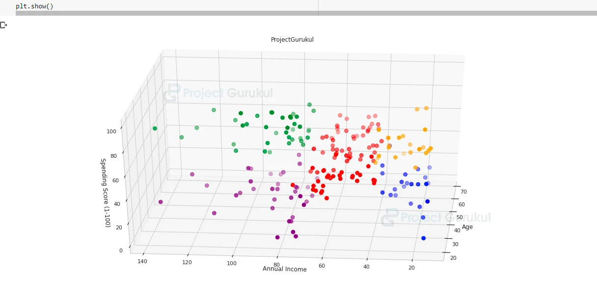
In this graph, each color represents different features.
Summary
In this machine learning project, we successfully created Segments of customers using the K-means clustering algorithm. We learned how to analyze the dataset in different ways, and also visualize the dataset to know the details of the dataset and find the relation between different columns. We also learned about K-means clustering and how to use it efficiently to create clusters and segment the data.
Can you explain why haven’t you used the gender attribute for clustering